The CockroachDB Docs site is home to our product documentation for CockroachDB and CockroachDB Dedicated, our two product offerings. It includes reference documentation, conceptual documentation, developer guides, tutorials, and much more.
Cockroach Labs has always prioritized its documentation, investing in it from very early in the company’s existence. We believe clear, concise, and helpful docs are important in enabling our users to be self-sufficient in testing, deploying, and interacting with our products. They’re an important tool that internal users, such as Support and Sales, also reference. Each document goes through a thorough research, draft, and review process– and while our Docs team owns the process, it’s a collaborative effort. Many times, a cross-functional group made up of engineers, product managers, designers, customer success– even members from our community!– will contribute.
No matter how good our content is though, that means very little if you can’t find what you’re looking for. We decided to redesign our site to improve its functionality, make our site easier for users to discover relevant content, and fine tune and add features within the docs.
As you explore the new site, you’ll see a number of things have changed.
You Are Here: Better Navigation through the CockroachDB Docs
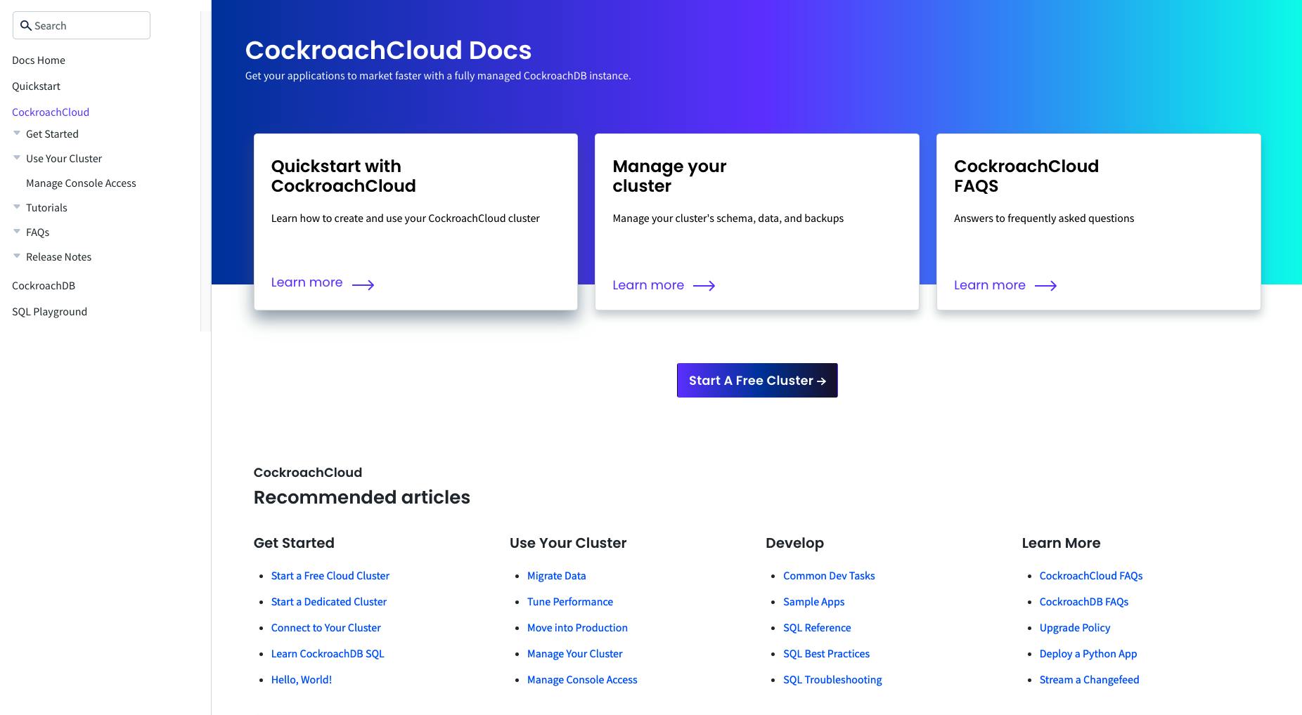
We’ve taken a new direction with our navigation. To navigate through Docs, there is now a left-panel that presents the following:
- A search box
- The quickest way to get started
- Our products ( CockroachDB Dedicated and CockroachDB)
- An interactive SQL shell to test features
We believe this will make it easier for users to find the content they are looking for when exploring our docs.
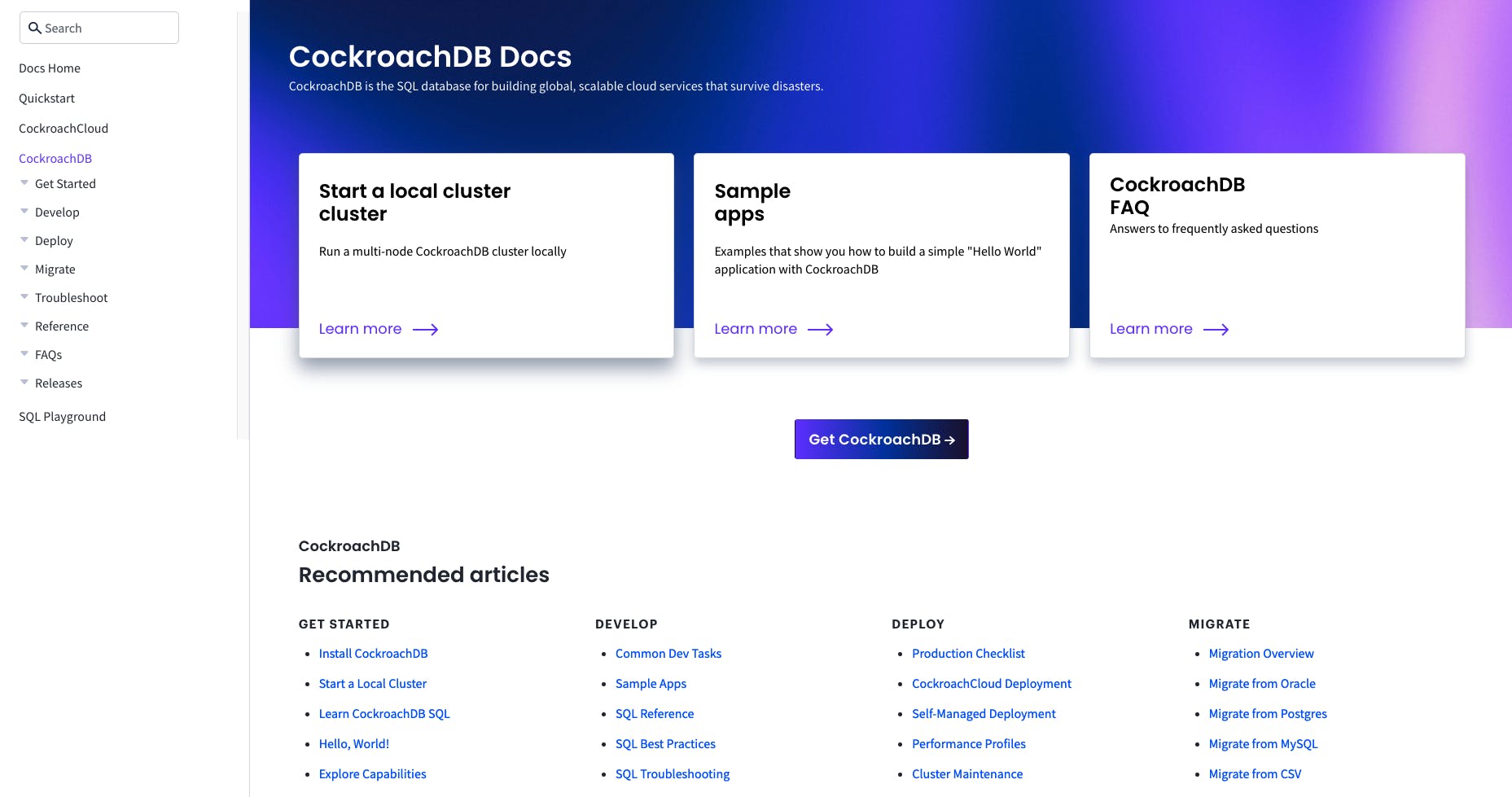
We’ve also added completely redesigned product area landing pages, as entry points for new users to learn about each product, and for returning users to find out about new releases.
There’s a landing page for CockroachDB Dedicated:

As well as CockroachDB:

Digital Accessibility Improvements to the CockroachDB Docs
Those with an eye for details might also notice that minor usability bugs have been improved. This includes updates to colors for accessibility, code-blocks enhanced for visual contrast, and sortable tables. These updates are small, but important– you might only notice them when they aren’t working right.
With that in mind, if you find a usability bug in our Docs, please file an issue!
In-browser Interactive SQL Shell in the CockroachDB Docs

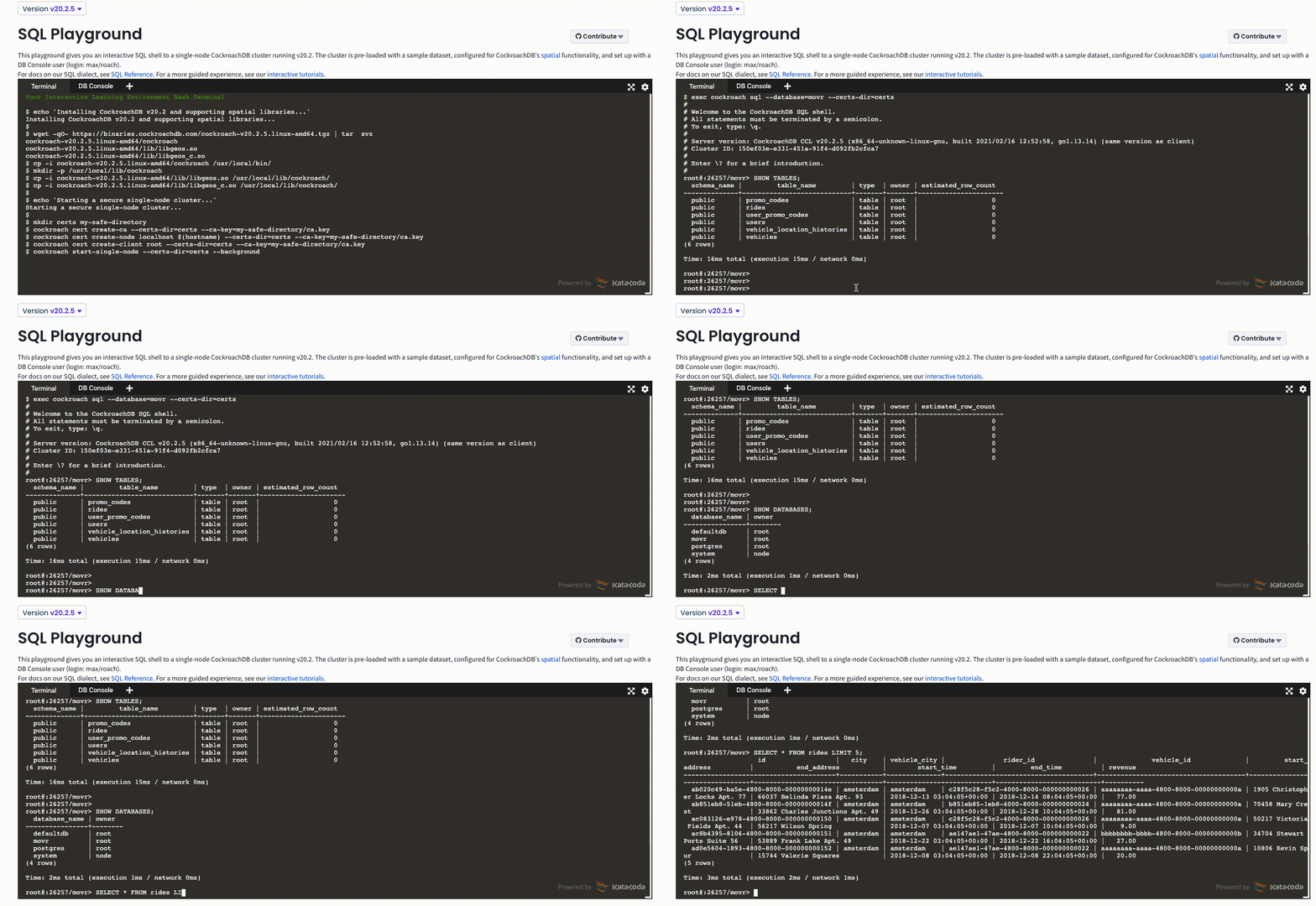
A really exciting addition to our docs is our new in-browser interactive SQL shell, also known as the “SQL Playground”. This playground gives you an interactive SQL shell to a single-node CockroachDB cluster, and is pre-loaded with a sample dataset. This will allow you to test features on your browser before launching into the “real” thing.
We also now offer interactive tutorials as more guided experiences within the SQL Playground.
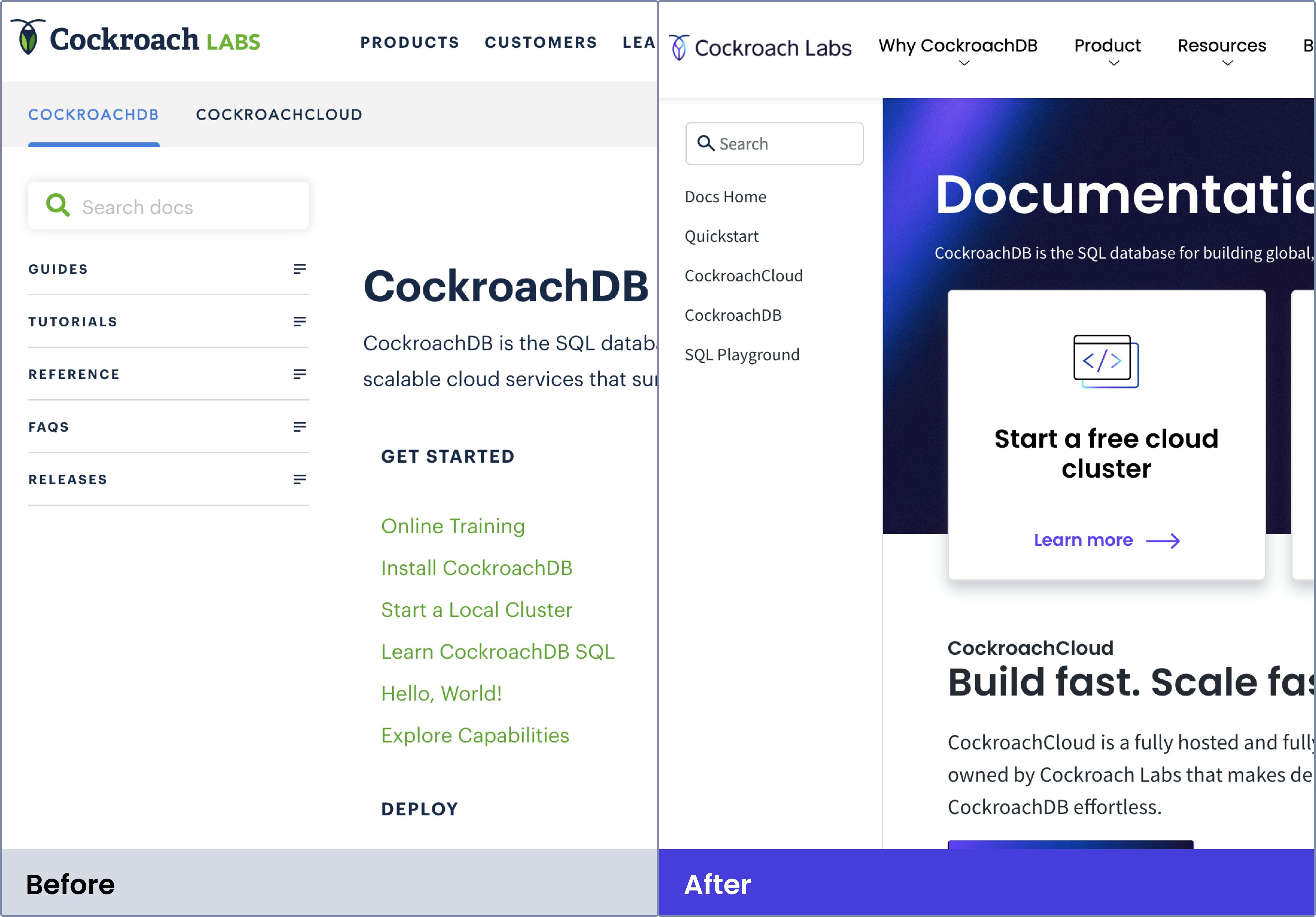
Goodbye, Green: A Refresh on Our Branding

Lastly, the branding has been fully updated. We are so excited about this! Our new colors, fonts and images are fabulous, you can explore them more on our main website. Along with visual updates, we have also added a new library of UI (user-interface) components that are used across the site. This includes buttons, fields, navigation bars, callouts, etc. Now, we are consistently styling and using these components, which not only makes it a cohesive and consistent experience for our users, but it also makes it easier for our engineering team to maintain.
Docs Sites We Admire
You might be wondering how we settled on what to change. As with many design projects, we started out by doing research. We connected with our colleagues and users to learn about what they liked or disliked about the site, how they navigated to find the content they were looking for, and what functionality they wished for. We were looking to define the needs that users have when they come to the docs site, so we could design solutions for those needs. We also analyzed other company’s documentation sites– like MongoDB and Stripe– that we considered successful, and critically evaluated what it was about them that we enjoyed. Then, we embarked on a design exploration, testing different prototypes (ranging from low-fidelity sketches to high-fidelity walkthroughs) until we landed on the final concept.
Usability Testing
Throughout our testing, we paid particular attention to making sure users felt oriented when navigating through the Docs Site, and prioritized the ability to locate content quickly while still having an enjoyable reading experience.
We are very excited to finally share these updates with everyone, knowing that while this will be a significant improvement, good design never stops. In the months following the redesign we will be monitoring our CSAT scores, page analytics, and gathering qualitative feedback to see how our users respond to the updates, and measure whether, in fact, our goals have been achieved. In the future, we will use these metrics and qualitative feedback to drive next steps and future improvements including exciting updates like Dark Mode, an improved search experience, and more. Stay tuned!
Contribute to the CockroachDB Docs
Our docs are open source and we encourage anyone to help improve them by contributing content, testing examples and tutorials, or filing issues for improvement suggestions.


